
📍 Mapping Education Development Projects in Afghanistan
This is the first time I've used R and LaTeX together, using a package called knitr. I believe papers that include statistical analyses should be fully reproducable, and part of my objective for this project is to learn how to accomplish that. I was partly inspired by this article on Chinese investments (also using AidData data), available as an R notebook 🔓 here. I also used this guide to help navigate the weird world of the maps R package. As I got further into the weeds of plotting the population density data, this Data Carpentry lesson was indispensable.
library(tidyverse)
library(maps)
library(mapdata)
library(raster)
library(rasterVis)
library(rgdal)
library(viridis)
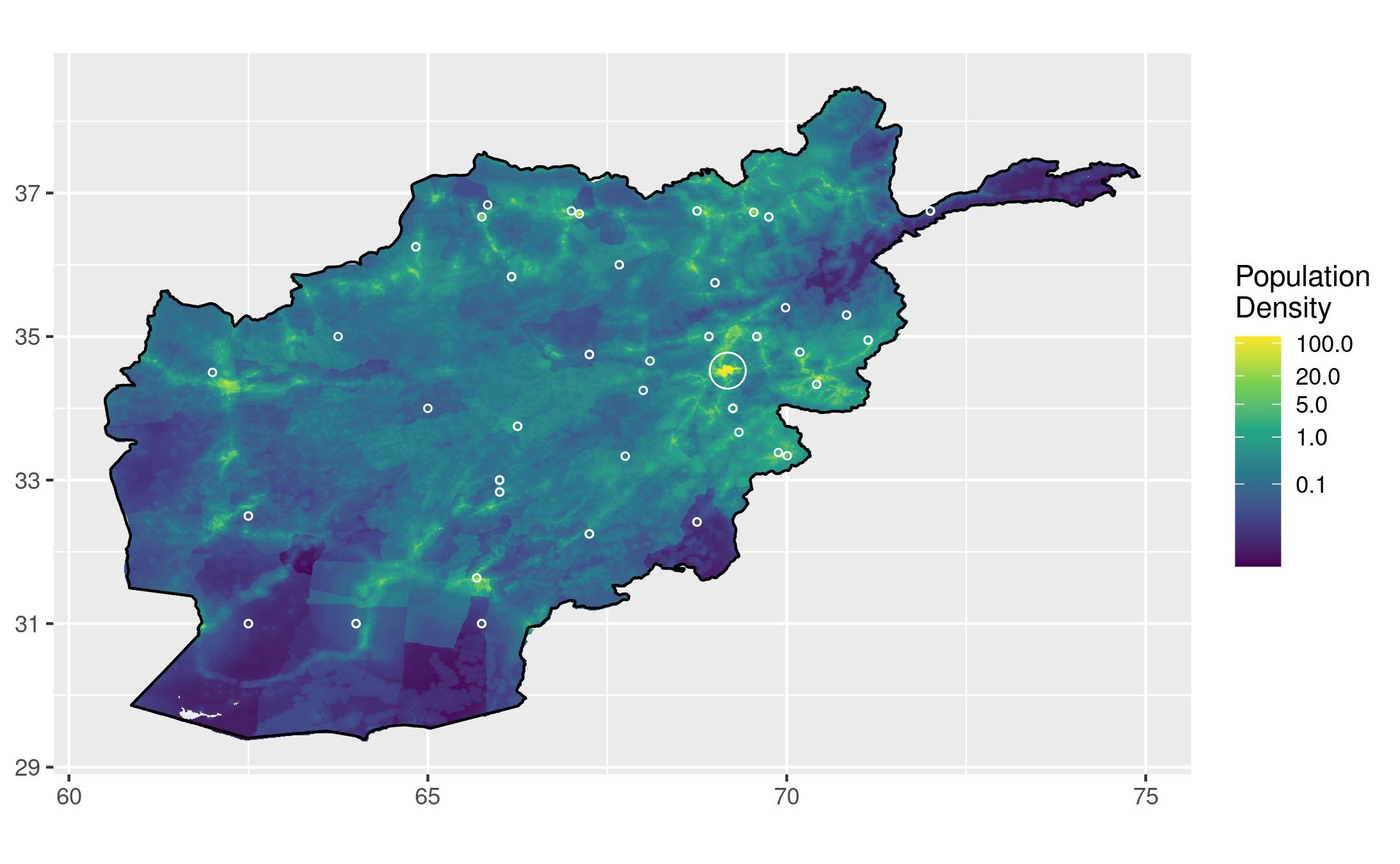
I requested a bunch of data about Afghanistan's education and forestry development from AidData. The download link for my query is 🔓 here. I decided to focus on the education data for this project, and experiment with overlaying the education project locations over a population density map of Afghanistan. I hope for this map to effectively convey how well-distributed these projects have been relative to populous areas. Have a majority of these projects been in cities, or in a specific region?
Directly converting the population density raster to a data frame ate my laptop's memory and caused R to crash, simply outputting "Killed" in my terminal. I ended up asking for help, and it was suggested that I aggregate the data before conversion. I'm annoyed that R can't handle this data file with better memory management (and I dream of pixel-perfect output!), but the aggregated data still looks very nice.
# Import AidData dataset
# Make sure you edit this path to reflect the file's location on your machine
inscription_data = read.csv("results.csv", header = TRUE)
education_data <- filter(inscription_data,
                         grepl("Afghanistan", recipients),
                         grepl("education", ad_sector_names))

# Import population density data for Afghanistan (2020)
afg_pop <- raster("afg_ppp_2020.tif")
# Theoretically not necessary if you have a lot of RAM overhead 🙄
afg_pop2 <- aggregate(afg_pop, 10)
# This is the line that caused my laptop to crash without the aggregated input
afg_pop_df <- as.data.frame(afg_pop2, xy = TRUE)

afg <- map_data("worldHires", "Afghanistan")

# Let's define a map that plots the population data all pretty
pop_map <- ggplot() +
  # Remove axis labels because it is clear they are lat/long
  theme(axis.title.x = element_blank(),
        axis.title.y = element_blank()) +
  # Add population data
  geom_raster(data = afg_pop_df,
              aes(x = x, y = y, fill = afg_ppp_2020)) +
  # Define scaling for population data
  scale_fill_continuous(name = "Population\nDensity",
              # Poke holes wherever there isn't data
              na.value = NA,
              # Use pretty, colorblind-friendly colours
              type = "viridis",
              # Use logarithmic scale
              trans = "log10",
              # Custom breaks to make key more readable
              breaks = c(0.1,1,5,20,100)) +
  # Add outline of Afghanistan on top for a cleaner edge
  geom_polygon(data = afg,
               aes(x = long, y = lat, group = group),
               fill = NA,
               color = "black")

# Now let's add the education project data to the map, and plot it!
pop_map +
  # Add education project sites
	geom_point(data = education_data,
             aes(x = longitude, y = latitude),
             # Circular points
             shape = 21,
	           size = 1,
             color = "white",
             # Do not fill circles
             fill = NA) +
  coord_equal()
 Full-size image
That looks great! I know it's wrong to not have units for the population density scale, and that's something I'd like to fix. The value of each pixel in the original image represented the number of people in the area that it covered, so the numbers on this scale should represent the number of people who live within each of the aggregated chunks. I think this issue would be best solved by calculating the distance each chunk covers in mi/km, and then adjusting the values in the legend to represent people per square mi/km.
That cluster of projects (and people!) in the Northeast is Kabul. How many projects are occuring in the greater Kabul area?
# Coordinates from Wikipedia article on Kabul
kabul_lat <- 34.525278
kabul_long <- 69.178333
radius <- 0.3

# New data frame from education_data with just the rows within radius of those coordinates
near_kabul <- filter(education_data,
                     between(latitude, (kabul_lat - radius), (kabul_lat + radius)),
                     between(longitude, (kabul_long - radius), (kabul_long + radius)))
# The number of projects within that radius can be determined using the following command
nrow(near_kabul)
# I've suppressed the output of this code chunk so that I can call this command inline
 Full-size image
I think that looks a lot nicer, although it might benefit from more detailed info in the legend about what different sizes of circles indicate. I don't notice anything groundbreaking on this map. There might be fewer projects on the Western side of the country, but I guess that has more to do with the population around Kabul than any other bias. Kabul is nearly 10 times as populous as the second-biggest city, Kandahar, so it is no surprise to see a majority of projects in that region.
Is this really all of the projects? Our education_data variable has `r nrow(education_data)` rows, and even with the `r nrow(near_kabul)` removed around Kabul, are all of them being displayed? I noticed that the dataset has rounded numbers for a lot of the latitude and longitude values, which could mean that many projects in the same town are drawn on top of each other. For example, there are three projects in Badakhshan that are all listed as having the exact same coordinates, despite differing descriptions, years, and dollars spent. There are two methods I'd like to use to mitigate this problem. The first is to cluster points that are within a radius of each other, and draw circles of proportional size to represent each cluster. The second is to calculate the average population density within a radius of each project, and then create a bar chart with each bar representing a range of population densities, and its length representing the number of projects that fall within an area of that density. It might be useful to create a few charts using different radii of average density.
Other variables could be controlled to better represent the differences in aid allocation across Afghanistan. For example, the size of each point on the map could be scaled based on the monetary value of the project it represents, giving the viewer a better idea of where the majority of funds are allocated geographically. Projects in urban areas might receive more funding to serve more people, or maybe the cost of building a school in a rural area would be significantly more expensive, for example. The source of funding, years active, and preexisting school enrollment are all potentially insightful variables to incorporate in a visualization like this.
Data Sources
Goodman, S., BenYishay, A., Lv, Z., & Runfola, D. (2019). GeoQuery: Integrating HPC systems andpublic web-based geospatial data tools. Computers & Geosciences, 122, 103-112. The data from AidData used in this project were downloaded from 🔓 this page.
WorldPop (www.worldpop.org - School of Geography and Environmental Science, University of Southampton; Department of Geography and Geosciences, University of Louisville; Departement de Geographie, Universite de Namur) and Center for International Earth Science Information Network (CIESIN), Columbia University (2018). Global High Resolution Population Denominators Project - Funded by The Bill and Melinda Gates Foundation (OPP1134076). https://dx.doi.org/10.5258/SOTON/WP00645 The data from WorldPop used in this project were downloaded from this page.